Yape
Marketplace
Eyeing expansion, Yape made its first move into retail, CrediCorp's first bet on unfamiliar territory. The mission: define the Marketplace's value proposition and ship its first release.
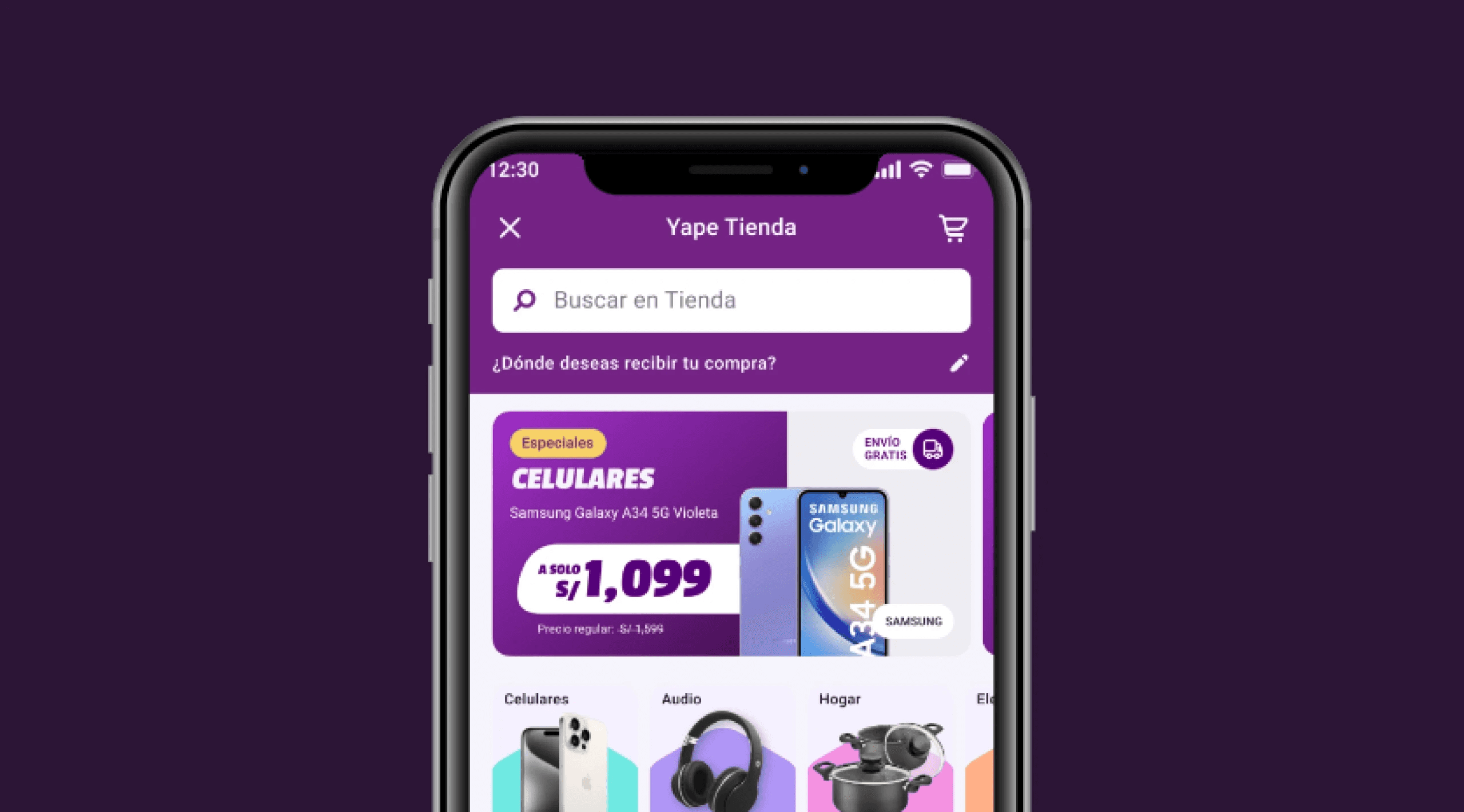
The Challenge
The biggest challenge for the Yape Tienda project was the absence of prior experience within the Credicorp group in the retail sector. This gap required the team to embark on a steep learning curve to understand the nuances and intricacies of retail platform behavior and how to seamlessly integrate it into an engaging and efficient shopping experience. The design perspective necessitated not only a deep dive into user behavior and platform functionality but also a strategic approach to interface design and user experience optimization.
Furthermore, the technical limitations posed by the retail provider, Vtex, added an additional layer of complexity. These constraints required the design team to be highly adaptable and responsive, continually iterating and refining solutions to ensure they met the technical specifications while still delivering a high-quality user experience. Each release demanded innovative problem-solving and a keen attention to detail to implement the most effective and viable solutions, ensuring that the platform could scale and evolve to meet user needs.
Product Design
UX/UI

Goal & Results
The initial goal was ambitious: to launch the first-ever marketplace for the Credicorp group within a record timeframe of just 6 months. This required meticulous planning, rapid development, and seamless execution. The target set for the first 3 months post-launch was equally challenging, aiming for users to complete 25,000 transactions on the app. Achieving this milestone would not only demonstrate the platform's robustness and appeal but also establish a strong foundation for future growth and user engagement. The pressure was on to deliver a high-quality, fully functional marketplace that could quickly gain traction and meet these ambitious objectives.
We started by validating Yape Tienda's value proposition through ideation workshops with potential users surfacing the specific pain points that shaped the platform's core feature set, rather than guessing at what users wanted. From those validated needs, we designed an end-to-end experience flow that mapped every user interaction across the marketplace. This blueprint cut downstream ambiguity and let development move without rework. We then scoped the design into an MVP, prioritizing only the features that drove the most user value. The result: a faster launch and a product built to iterate against real user feedback from day one.


(Project)